Salt & Sanctuary is an interesting 2D Souls-like with an artstyle and overall control feeling that really turned me off. It’s a bit of a bummer, because it also felt like a metroidvania in some capacity and the skill tree/item systems were really speaking out to me. Ultimately it was a bit too “floaty” and unprecise, while at the same time requiring too much precision, for me to stick with.
Character creation started a bit too roughly for me, having the option to pick a class with a bunch of “effects” and different pieces of gear without knowing what anything does (and without having tooltips explaining anything) really overwhelmed me immediately. The game itself starts pretty good, with your character on a boat in the middle of some sort of conflict. The game immediately felt very souls-like, with a stamina bar, some kind of flask you can drink to recover health, cryptic messages and gameplay mechanics that seem very complicated, like having a bunch of stats.
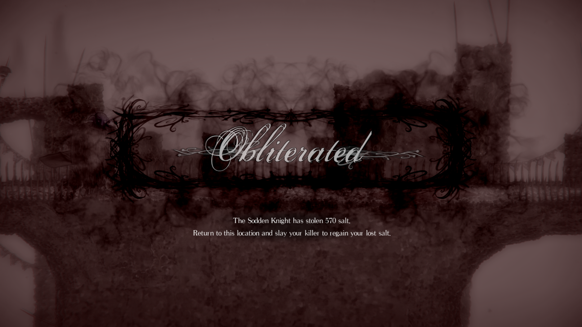
The skill tree looked really cool! having job levels, stats and other upgrades tied up to some massive graph always speaks out to me, but the gameplay itself did not, the graphic style and how characters controlled felt to me like it was really difficult to say whether I was going to get hit, if I was hitting the enemy, or when I was safe. The first real boss I fought was a trainwreck, I felt like I was getting hit while nothing was going on, or some attacks had animations that just looked like nothing and felt really bad to react to.
Ultimately, while I’m always ready to give a shot to a Soulslike, I need some snappy and simple basic controls that feel good, and Salt & Sanctuary didn’t provide that for me. I think it’s a much beloved game overall, for critics and other fans of the genre alike, but it really didn’t do it for me!


