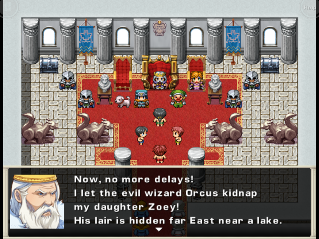
I'm on a bad streak of iPad games nowadays, okay, Devil's Attorney was great, but the games I've been trying out recently... They're not very good. Take Doom & Destiny for instance, I'm kinda baffled how a game full of RPG maker assets could land on iOS. Can you even use RPG Maker to make iOS games? Probably not, but this game feels like it. Also it's pretty immature and dumb, like Unepic was. I probably would've cared much more about it if it played the story straight.
Everything about the story in this game is kind of a trainwreck, the main characters are 'geeks' pretending to play 'dungeons and dragons' and they're transported into a wacky world where they have real powers and magics! And the spaghetti monster, and magic missile, and dickbutt jokes. it's hard to take the game seriously when every NPC, item, monster, skill and story beat is about dumb stuff.Why not make it a plain RPG where you have a bunch of heroes that go and save the world, no need to be edgy. I know that the story is not a 'huge' part of the gameplay, but if it's cringeworthy enough for me to not want to play it...
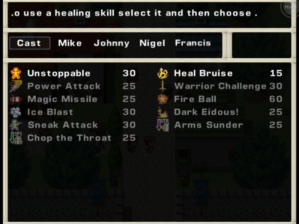
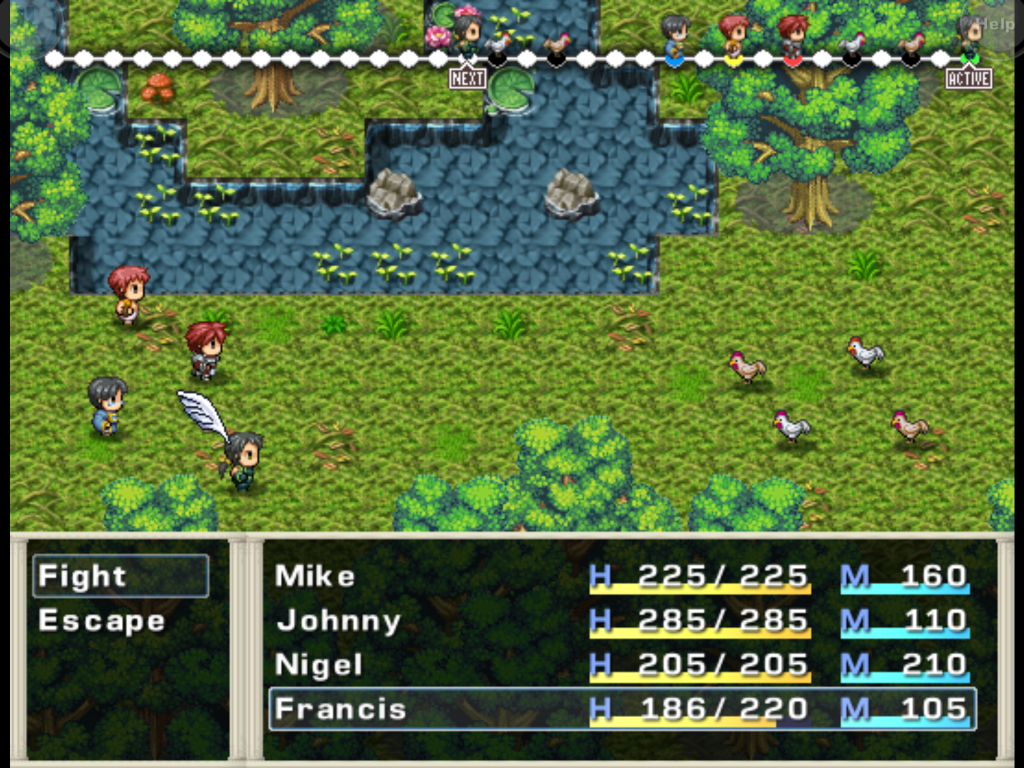
And that's too bad, because I generally love the systems this game has. You place points into four stats when you levelup and these stats give you skill points. You then spend these skill points to 'slot' your skills, a bit like Final Fantasy 9. You choose a party leader and then they give stats to your other teammates depending on where you place them. There are achievement-like challenges (kill 10 orcs, then kill 100 orcs, etc.) that give actual in-game rewards, and that's all good. Even the battle system is fairly complex with a bar at the top and you spend time units to act, pushing you more or less farther from your next turn. On the other hand, I can't really decide what skill to use - it's hard to see what they do differently - and I haven't seen a big difference when changing my team leader. Maybe later on it would make a big difference, but I'll probably never get there anyways.
Another thing I didn't like about Doom & Destiny - and a final nail in the attention span coffin - are the controls. The left side of the screen represents movement, the right side are actions. There's a virtual circle to control where you move and you select different things by tapping on the right side of the screen then moving in directions - for instance, 'cancel' is tap + move to the left. I hate that. Give me virtual buttons for movement and actions. I'd rather have 4 arrows on the bottom-left of my screen than having to tap and hold and move a circle around. Even letting me tap menu options would be a nice start. In most games, virtual buttons are a pain, but turn-based RPG aren't precision-based and seeing all of your options easily is better than fumbling around.
Some systems are good, it seems like there's a ton of content in this - even thought I don't want to be part of any of it - I can't really recommend Doom & Destiny.


